social media

ActionSprout: It’s not how big your page, it’s how you use it

Crossposted from ActionSprout’s blog

GleeEngagementA marketing consulting that Action Sprout works with emailed us saying she noticed that the top trending content on Upworthy’s Facebook page isn’t their videos and links that drive people to their own page, but instead posts that simply have images attached to them but don’t drive off Facebook.
Use our engagement tool and have a look at Upworthy for yourself.  Or even check out the Facebook page for the TV show Glee and see what their engagement score is.  With over 25 Million fans, Glee’s top performing post (which out performed other posts on their page by 598%) only had 2,945 shares on it.  If you have over 25 million fans and you can’t break 3,000 shares, something is wrong, period.
Upworthy is the best example of a Facebook page that proves that sometimes it isn’t how big your page is, it’s how you use it.  Jokes aside, compare the Upworthy engagement to our friends at OurTime.org.  I’ll give you a hint: with just over 100,000 fans on their page, OurTime.org’s top performing post last week nearly broke 100,000 shares and all of their posts were over 3,000 shares.  When you analyze the content on both pages, you’ll see that the top trending content on both pages tends to be more visual content. This not only due to the fact that visual content draws people to it, it is also related to the age old problem of Facebook prioritizing content that keeps you on Facebook.
Think about it: Facebook makes ad money when you’re on Facebook.  If you click off of Facebook to another  website, Facebook loses you and the chance to monetize your eye attention. So what is Facebook to do? Well, they increase the priority of content that keeps you on Facebook.  This means videos, status updates, graphics including memes and photo albums, questions and polls, and of course applications like ActionSprout get the extra edge. And your link, well, it’s going the way of the dodo bird.
A new ActionSprout client approached us asking about best practices on memes and links on memes last week: “Doesn’t having a link on your meme decrease your engagement?”  In one answer: No. And if you’re not putting links on your memes, particularly an ActionSprout link on your meme, you’re missing the opportunity to capture data from that person that you can use to retarget them on Facebook and off.
If your audience doesn’t click on links on memes, it is only because you haven’t trained them to do so.  Crazy, I know, to think of your Facebook audience as being “trained” but this is exactly why you see different pages doing different things and garnering success from them.
This is where ActionSprout can be a benefit. If you want to get the largest percentage of your followers to see your content you’ve got to keep them within the Facebook garden walls and you’ve got to get them clicking. How does that help your organization though? Your blog posts, your petitions, your entire organization exists on your website, so what is a non-profit to do?
This is what ActionSprout does. We can take your petitions and your list development and keep it on Facebook to optimize the percentage of people seeing your petitions. W also show you the highest performing content from the pages you follow through our Inspire Tool so you can borrow other good ideas and content that is consistent with your organizations own messaging.
The next step is creating a culture of clicking – just like OurTime.org has created a culture of “sharing.”  The easiest way is to ask.  CLICK here if you believe ……  CLICK here if you want to see….. The sure fire way to get people to click is to tell them to do it.
Some people will share – that’s great – but when followers see your fan’s share your content, we want them to click TOO.  Once you work your way up to having a higher click rate on your memes then take it a step further and ask them to CLICK and SHARE if you believe….
If you’re sharing a meme and not sticking a link on it, not funneling people toward an action, not driving traffic back to your site, then you’re doing it wrong.
Facebooktwitterpinterestrssvimeotumblrinstagramflickr

1995 Called: They Want their Website Back

Bad website no cookieEvery day I get a question about website design, new media consulting firms, and social media integration into your website or new media outreach.  Some of the most basic questions like “what should I do” or “how much should I pay” all comes down to what you want to get and what your goals and aims are.

Thus I’ve put together a handy list of mistakes and suggestions as well as the typical questions and how to answer them.

1.  Highly customizable websites don’t mean they’re good websites.

Many firms want to charge you very little to do proprietary websites under the guise of it being 100% about YOU and stand out have that design firm create it from scratch for you.

Here’s why this is bad:

  • You ultimately have no control over your own website after it’s designed
  • Customized websites are BAD for SEO
  • You can’t update your own content without your consultant
  • You can’t create additional pages, posts, information, or content that brings people back to your page without your designer or consultant

Let me also expand on this idea of something standing out and being 100% you.  Having a website that is all about you is what websites were for in the 1990’s.  Web 2.0 deign and outreach is more about simple, easy, uncomplicated design that has information that is engaging.

Read more below the click……

Read more

Facebooktwitterpinterestrssvimeotumblrinstagramflickr

Pinterest is Famous!

Well what do you know… it seems the ladies not only like Pinterest … they trust posts on Pinterest too

According to BlogHer’s annual study on women and social media, when asked whether they trusted different social media sources, 81 percent of women representing the general U.S. population said they trusted blogs and Pinterest, while 67 percent said they trusted Facebook and 73 percent said they trusted Twitter. (The questions were asked of those who indicated that they used each of the social media services.)

We’ve heard for the last several months that women like Pinterest – that the majority of users are ladies. According to my good friend Beth Becker who has become the unofficial Pinterest expert the site is used primarily women in the midwest and southeast. (Actually Beth mentioned this in passing not at the link but… still read the above link)

Interestingly, Pinterest is also becoming more powerful than the Twitter when it comes to referral traffic:

A new study by online sharing tool Shareaholic has found that Pinterest now drives more referral traffic than Twitter.

Check out this graph – it’s even bigger than Google+. Eeek! Embarrassing!

Read more

Facebooktwitterpinterestrssvimeotumblrinstagramflickr

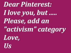
Dear Pinterest Please add Activism (or Politics)

At the suggestion of someone on one of the lists somewhere I am quickly coming around to the idea that the solution for activism and mobilization on Pinterest is to add an activism category. . . so… Please repin my lobbying graphic!

Facebooktwitterpinterestrssvimeotumblrinstagramflickr

Pinterest Experiment leads to Addiction

After an un-conference on net tools for activism and campaigns, I decided to embark on the Pinterest Experiment. While I have indeed created the political pin board – I have also created a design/architecture pin board that has now enabled me to geek out to an extreme. For those late nights and early mornings when I am stumbling the “architecture” category, I now have an opportunity to pin up my favorites and easily refer back to them, share them with my fellow addicts, and collect them for my other addiction, designing modern houses on the Sims.

Will this be my downfall? I think perhaps.

Facebooktwitterpinterestrssvimeotumblrinstagramflickr

An Experiment: Pinterest as Activism

During an interesting day with @Ravenb @cksieloff @banditelli and then @melissaryan while participating at #Roots12 we began a conversation about Pinterest. Pinterest, if you didn’t know, is a site similar to a pinbaord where users can upload or tag a photo that are all placed on the “online pinboard.” Many use it for design or fashion and predominantly the demographic of users is female. Consequently, the online community views the website as a girly BS site – except it’s kind of become a thing, leaving many male online folk to scratch their head with this girly site. In a great piece How to stop being a pinterest sexist we learned

Whether or not Pinterest is a site “for women,” women make up 70%–80% of its user base and 97% of its fans on Facebook. That’s just the current reality. Meanwhile, men still do a majority of the tech blogging…and most of the men in the tech blogging world missed the boat on Pinterest. They didn’t get it, they thought it was “just for women,” and they dismissed it.

Until recently, that is. Now that Pinterest is The Next Big Thing, everyone’s scrambling to catch up. Except so many of the articles being written about Pinterest now — especially (but not exclusively) those written by and for men — are still off-point, and sometimes? Just plain offensive.

So… my mission, and yes I have chosen to accept it, is to figure out how we can use Pinterest as an online organizing tool. So…. here’s my Pinterest …. Thus far I’ve preloaded it with all sorts of political whatnot focusing specifically on cute things and women’s issues. I put cute things on because… well… I like cute things. We’ll see how it works out. Here we go.

Facebooktwitterpinterestrssvimeotumblrinstagramflickr